A paint shade may look perfect on a small card and strangely dull once it covers an entire wall. That is usually not a failure of taste, as the room’s daylight, artificial lighting, furniture, wall condition, and daily use must all be considered.
A living room may see fingerprints, furniture movement, and frequent cleaning. A bedroom needs visual calm, but the wall behind the headboard can still collect marks. Kitchens deal with cooking residue, and children’s rooms rarely remain untouched for long.
Once you acknowledge those differences, room-wise paint selection becomes less about chasing one universally “perfect” paint and more about making several sensible, connected choices.
| Finding the best interior paint for home therefore begins with the question: what will this room ask of its walls every day? We answer that and more in this article so that you can make an informed decision before painting your home. |
Begin With The Life Of The Room
Before choosing a shade, note how the room is used, how much daylight it receives, and how often the walls will likely need cleaning. The best interior paint for home should suit the space’s level of activity. For instance, a rarely used guest bedroom does not carry the same maintenance burden as a passage connecting the kitchen, bedrooms, and entrance. Nor does a formal sitting room need to be treated like a child’s play area.
Spending more where the surface needs it, rather than applying one premium product everywhere, produces a better-balanced specification.
Look At Four Things Before Making The Shortlist:
- Frequency of touching, rubbing, and cleaning.
- Natural light during both the morning and afternoon.
- Exposure to cooking vapour, moisture, or dust.
- Existing wall defects, repairs, and colour patches.
The wall itself deserves attention too: fine cracks, chalky old paint, damp patches, and uneven putty cannot be hidden permanently by a fashionable finish. Correct these conditions before painting, then apply the primer and the recommended application system.
Choose A Finish For Maintenance, Not Just Appearance
Matte paint has a restrained appearance and generally shows fewer minor surface irregularities than a reflective finish. It may suit low-traffic bedrooms, formal rooms and ceilings. A soft-sheen or satin-like surface reflects more light and is often easier to maintain, making the choice more practical for active family areas.
However, stronger reflection may reveal waviness or imperfect preparation: in a long passage with light falling sideways, a glossy finish can make every roller mark noticeable. This is where the best interior paint for home becomes a combination of product, finish, and workmanship.
BIS Standard IS 15489:2024 classifies plastic-emulsion paints by finishes including matte, eggshell or satin, semi-gloss, and glossy. The related product manual also lists tests covering finish, opacity, drying, recoating, alkali resistance, and volatile organic compounds.
It is a useful reminder that interior paint performance involves more than shade and price. For a clearer comparison of these finishes, see our guide on matte vs satin vs gloss.
Account For Light, Movement, And Continuity In The Living Room
Start with the fixed elements: flooring, sofa fabric, curtains, wood tones, and stone surfaces. If those materials already carry several colours, a quieter wall palette may give the room some breathing room. Where the furniture is neutral and simple, one deeper wall or a controlled texture can become the room’s centre.
For a family living room, Impulse Glow Emulsion offers a premium option within Colour Valley’s interior range. Where the room is intended to have a more refined, high-end character, Interio Signature sits in the ultra-luxury category.
These classifications come from Colour Valley’s current range, so you should still check the final selection against the product directions, desired sheen, and wall condition.
What you can do: Test shortlisted shades behind the sofa and on the wall opposite the largest window. A beige that appears warm near a lamp may look grey in indirect daylight. The best interior paint for home is the one that remains convincing through these “filters”, not merely the colour that looked brightest in the shop.
Keep The Background Quiet In The Bedroom
The best paint for bedroom spaces should support rest while still feeling personal. Muted greens, dusty blues, warm off-whites, clay-toned neutrals, and softened mauves can work well. The undertone is important: a cool grey beside yellow lighting may look slightly muddy, but a creamy white beside dark wooden furniture may feel warmer and more settled.
It is also not prudent to assume every bedroom must be matte. If wardrobes, switches, and the headboard sit close to the painted surface, consider cleanability. A low or gentle sheen can be practical where walls receive regular contact, provided the preparation is even. In a quiet guest room, though, Ezy Go Interior may offer a regular-category option without specifying more paint than the room’s use reasonably demands.
Make Cleaning Integral to the Kitchen Area
You can’t choose the best paint for kitchen walls as if the kitchen were an untouched space. Even with a tiled backsplash, painted areas collect fine grease, steam, and repeated hand marks. A maintainable finish is usually more useful here than a deep matte surface selected only for appearance. Proper ventilation and timely cleaning are also critical. Mid-tones are often forgiving, though a small or shaded kitchen may benefit from a lighter colour base.
Rather than covering every wall with a strong yellow, red or green, place colour on a breakfast corner or a wall away from the main cooking zone. Repeating that accent in dining chairs, crockery or a pendant light creates connection without making the scheme feel busy. In case of an open kitchen, stand in the living room and view both spaces together: a shared undertone or repeated neutral keeps the transition from looking accidental.
Children’s Rooms, Passages And Workspaces Need Their Own Logic
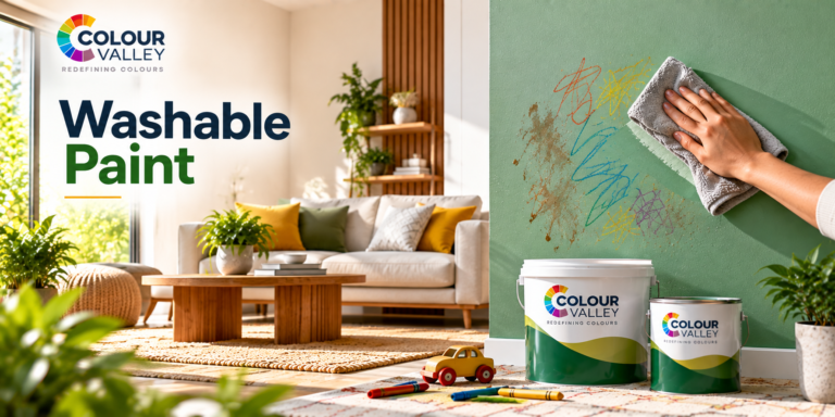
Paler colours are not compulsory, nor are loud primary shades. A grounded neutral with a changeable accent wall allows the room to grow, while artwork, shelves, and bedding can carry brighter colour. For heavily used areas, ask specifically about the appropriate washable interior option and follow the recommended cleaning period after application.
A home office presents a different problem, with video calls, window glare, and task lighting exposing an overly reflective wall. Mid-light colours with controlled sheen generally form a steadier background. Test the sample near the desk rather than at the room entrance. This is because the best interior paint for home sometimes reveals itself from the chair where the room is actually used.
Sample First, Then Build A Connected Palette
Paint at least two sample patches large enough to judge properly: view them in daylight, after sunset, and beside the room’s permanent materials. A sheet of white paper placed next to the patch can make hidden green, pink, or yellow undertones easier to notice. Across the house, choose one recurring neutral for ceilings, passages, or connecting walls. That approach gives each room an identity without making the home feel like a collection of unrelated colour cards.
Colour Valley’s interior range provides options from economy and regular emulsions to premium and ultra-luxury finishes. This makes it possible to specify room by room rather than overspend or compromise everywhere. You must still do your research, test the shades, and find the right paint for your room before the first full coat goes on.